top of page

Nespresso website redesign
While working as Nespresso's digital art director I was tasked with suggesting a UX/UI redesign for the company consumer website. The redesign received very positive feedback but in the end we couldn't go through with the project due to the global consistency of the brand.
Unlike everything else in the brand, the Nespresso website does not promote the same brand values and experience. The User experience is outdated, confusing and convoluted. My aim was to bring the website to the same high standard level as the branding, the product and the boutiques are. Where in all other brand aspects Nespresso is synonymous with innovation, everyday luxury and high quality, in the case of its website, Nespresso was way behind the times.

Design & Visual Inspiration
After creating UX wireframes I collected visual inspirations based on the brand values. My site UI, combined lifestyle photography, minimalist product photography and technical sketches.
Inspirations:

Technical Drawings

Coffee bean location inspiration

Jewels and luxury items


Coffee lifestyle
Exotic locations culture

HOMEPAGE
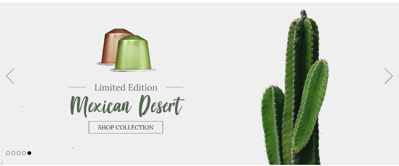
From the top I wanted to promote the sense of quality, expertise and luxury that is associated with the brand. By creating a header banner I could promote certain products while simultaneously selling the lifestyle with stunning photography.
Presenting the three main sales categories in a clear way, immediately bellow the welcome hero image slider, to help the user reach what they are looking for quickly. The page is made up of photos and cleaner sections with icons to create a rest for the eyes. The combination of a serif font and a calligraphy font that connect to the artistic and sophisticated style of the brand.
Nespresso is a lifestyle brand and it is important to promote this.
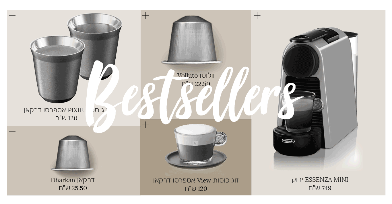
A bestsellers gallery in coffee colors, hovering shows the colors and pressing on the plus opens a quick view of the product.
Finding a boutique and a help section are what people search for most in the site, after the product sections of course.
Instagram is one of the main ways lifestyle brands promote themselves these days, and it is important for Nespresso to bring it's Instagram feed to the forefront of the customer's mind.


CAPSULE PAGE
The main business of this website is selling capsules. In my redesign the capsules are presented in a highly appealing way, as a high end product, almost like precious jewels.
Coffee specific filters


In addition to the technical information, the product page also takes the user into the Nespresso lifestyle and on a journey to the coffee beans' origins.
The specific product page presents the capsule in an appealing way, with all the coffee related information and technical information.
PRODUCT PAGE
wireframes
HOMEPAGE
The redesign required a full overhaul of the UX. This was done by streamlining many of the categories and focusing on two main goals- selling products and selling the lifestyle. Once I defined these goals I could combine different parts that were redundant, while creating new parts that would help elevate the site while driving sales and experience.
Presenting the three main sales categories in a clear way, immediately bellow the welcome hero image slider, to help the user reach what they are looking for quickly.
A section that promotes the lifestyle and core brand values.
Information sections that people may search for on the homepage, but don't need to be top of mind.

CAPSULE PAGE
Coffee specific filters on top of page. Because this is a brand that has very specific users they need to be able to filter to their exact wants.
Clearly presenting each capsule like you would fashion items in a fashion brand.

Clicking the "Quick view" option opens a popup with all the relevant information.

PRODUCT PAGE
A section that presents all the main information of the capsules and allows easy buy buttons.
Connecting the lifestyle and the coffee bean origin buy telling about the origin country.
Going into more technical details about the product, with a technical diagram.
Video section explaining the roasting process,
Another option to press the buy button.
A section that suggests additional products based on the buyers selection

bottom of page