top of page

PartyUp App Design
PartyUp is an app in which you can collect inspiration pics for events and theme parties uploaded by professional party planners, DIY bloggers and party supply shop owners. From the photos in the app you can immediatly purchase the party items or view the DIY tutorials.

MAIN COLORS

DESIGN THEMES
10 Pixel offset to underline
the DIY essence of the app

LOGO
ICONS


The Main App page presents inspiration pics and blog entries. The top tabs send the user to the most important parts of the app, the EVENTS tab being the predominant one. When scrolling down a footer appears with sections pertaining to personal use.
Because the photos in this world are so colorful, by making the UI very white and clean, it actually stands out. Scrolling down opens the footer that has quick options for the event you are planning.
1
2
One of the main challenges of the design process was presenting the colorful pictures of the party world in a way that was not overwhelming. By creating a clean, subtle and minimalist layout I was able to achieve this. The icon for saving is styled like a moodboard photo with tape.


3
Since these photos have so many details, I didn't want to clutter them with more icons, so you must press the magic wand to expose the products you can buy or DIY


4
Filters relevant to party planning, that adjust themselves according to other filters chosen.


5
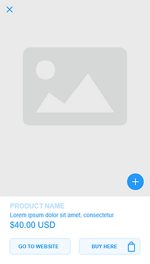
Product pages and DIY pages with easy and clear buying and creation processes

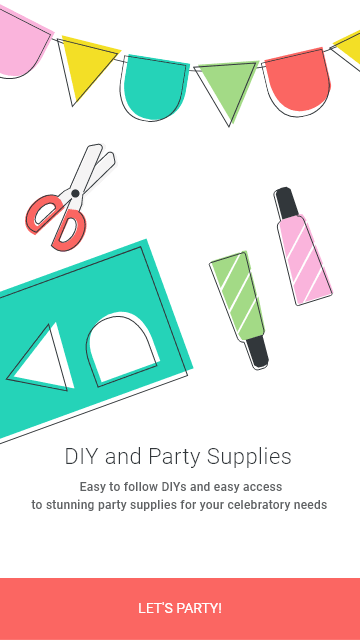

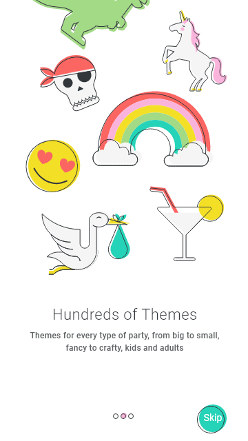

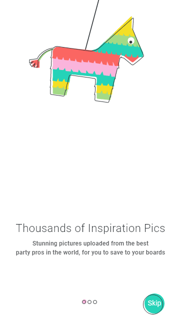
Onboarding

Wireframes


Homepage
Events page
Choosing event type
Photos after filtering
Photo page
Magic wand shows projects/products
Choosing project opens bottom options
Product page
Project page
All moodboards
Moodboard
bottom of page