top of page

Sharpie landing page
A landing page for Sharpie that shows the diverse way this simple marker can be used
Who, What, Why
Sharpie has long become a brand for more than just everyday use, it is a brand for artists. In an attempt to promote the diverse product line and connect new artists to the brand I created an interactive landing page that utilizes all the classic things people do with sharpies and drawings.

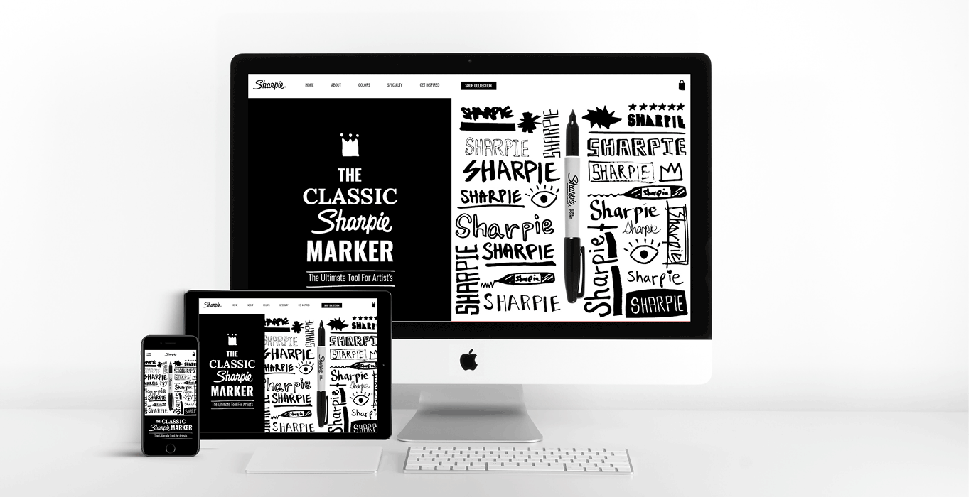
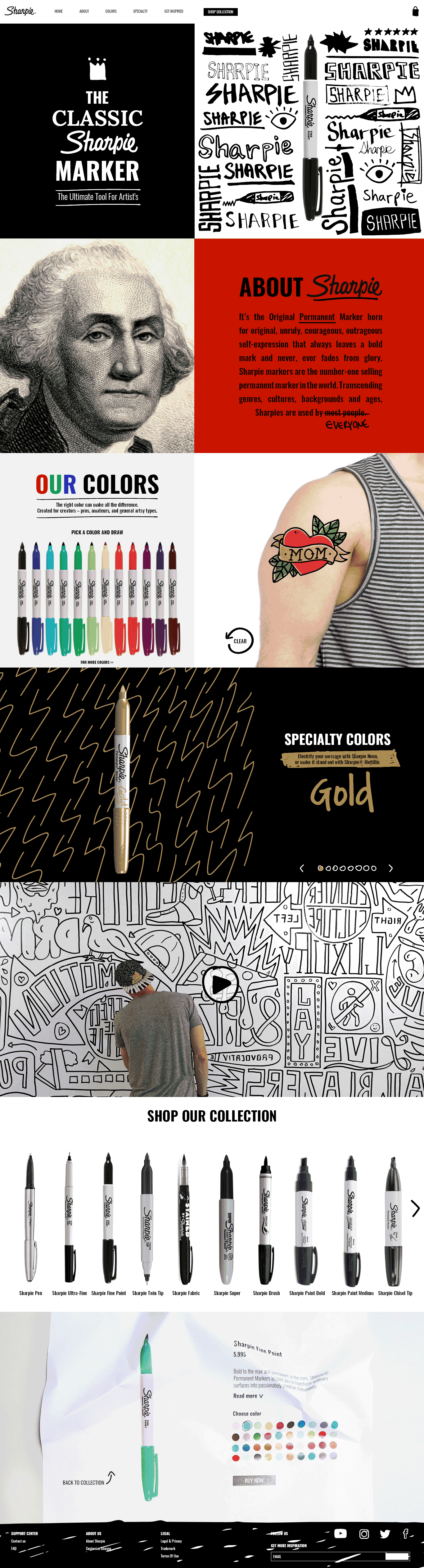
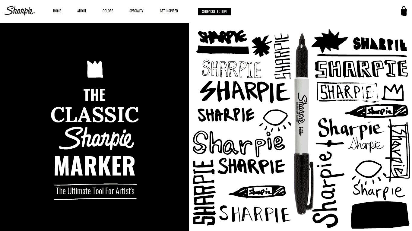
This landing page creates an experience for the user, pulling him into the Sharpie world, combining the low tech world of marker and paper with the high tech world. The page opens with classic Sharpie doodles.
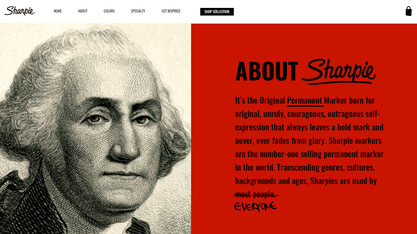
People have been drawing on photographs for decades, so it seemed only fitting to use this technique in the ABOUT section.
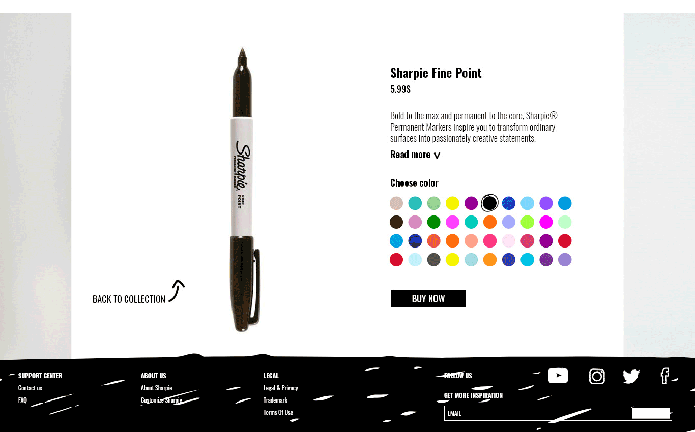
What better way to check the different colors than by drawing a tattoo?
Sharpies are often used to create patterns, so I displayed the different specialty colors using different patterns.
A little inspiration from some of the greatest Sharpie artists in the world with the medium of video.
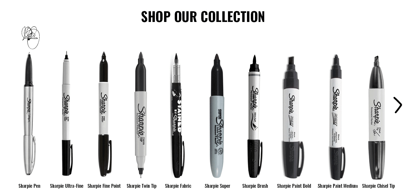
By hovering over the different types of markers you can see a doodle that shows you the brush stroke, just like you would do when testing them on a piece of paper.
When you return back to the collection from a specific marker, the page scrunches up.
Hand drawn footer.

The same experience, just using only the tip of the markers.
A change of the layout allows the patterns and specialty markers to still shine.
The video fills the whole screen in horizontal view.
Scrolling is done with your finger, since there is no hover in mobile you first choose the marker and then test it out.
Mobile friendly footer.


The responsive mobile version retains the same experience, with certain adjustments. the menu is placed in a hand drawn hamburger menu.
MOBILE
Wireframes
initial sketch

ux wireframe

bottom of page