top of page

Talko App
Talko is a language learning App that uses content based on the users interests in the language lessons and incorporates popular content products of the digital age, such as quizzes, trivia, games, etc.
MAIN COLORS
LOGO


DESIGN ELEMENTS

1
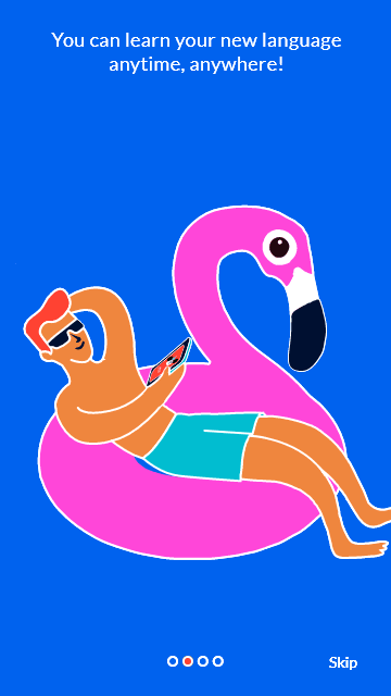
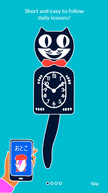
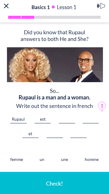
Starting immediately with the onboarding, the user gets a sense that this is a more fun and cool language learning app than the others in the market, full of pop culture references and up to date trivia and games

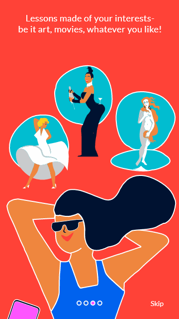


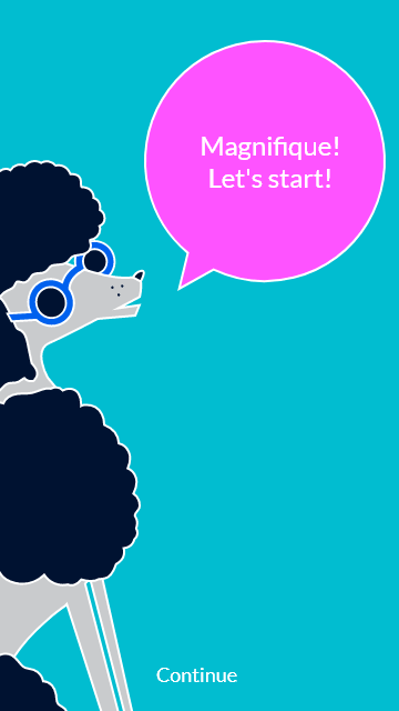
When the user chooses a language he is assigned a character that helps guide him through the process and teaches him about the app.
2


3
The registration process for this language app is longer and much more crucial than usual, because this is where the user chooses the interests that will later build his study materials. It was important to keep the user engaged and show him how many steps await him.


4

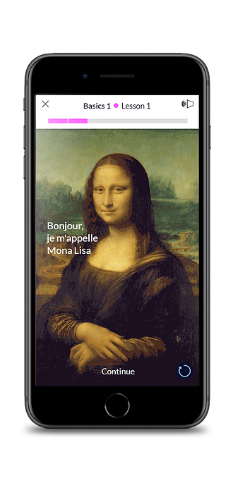
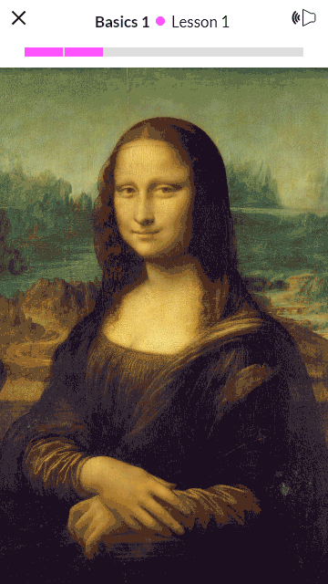
The lesson contents are very "busy"- gifs, vidoes, photographs, etc.
so the layout must be as clean and unassuming as possible. When scrolling down the lower menu appears, guiding the user to the different sections
5
Fun and new ways of teaching the material, combined with classic learning techniques


6
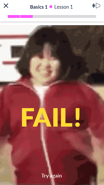
Creating anticipation for the usually more mundane parts of a language app- success or failure, by incorporating the usage of popular gifs


ICONS

Each language has a character that accompanies the user during the lessons, for example- Pierre, the french poodle for French

Wireframes
Other parts of the main app area keep in line with the simplicity the app requires


I divided the UX into three parts- the signup process, the main app and the lessons.
The key factor I kept in mind was streamlined and simplified processes, due to the "busy and distracting" content of the app.
Due to the personalized nature of the app, the sign up process is much longer than most.
My goal was to make it easy, fast and clear so as to not "lose" potential users.
Main app area that presents only the information needed and always shows you where you are at in the learning process.
A lesson grid that is as simple as possible and shows you what stage you are at was crucial due to the "busy" app content


bottom of page